May 5, 2026

The quick version
- The right luxury colour combination for a home doesn’t begin with paint swatches. It starts with how you want the space to feel, then builds outward from fixed finishes like flooring, stone, and cabinetry.
- Undertone consistency is what creates flow. If your timber, stone, metals, and wall colours share the same warm or cool base, the home reads as one cohesive thought rather than a series of disconnected rooms.
- Perth’s sunlight changes how every colour performs. Whites can appear blinding on exteriors, warm tones shift golden in north-facing rooms, and colours can look dramatically different from morning to afternoon.
- Trends belong in soft furnishings, rugs, and art, not in the fixed finishes you’ll live with for decades.
- A flat lay process, where physical samples are placed side by side and assessed together, is the most reliable way to catch clashes before they’re locked in.
Have you ever held a paint swatch against a wall and thought, that’s the one, only to see it look completely different once the whole room was painted? You’re not imagining it. Colour shifts under different light, against different materials, and at different times of day. In a small swatch under a shop’s fluorescent light, three shades of white look identical. Propped against a north-facing window at 2 pm in January, one goes cream, one goes grey, and one pulls faintly pink.
If you’ve been searching for the right luxury colour combination for home interiors and feeling overwhelmed by the options, you’re not alone. The challenge isn’t finding colours you like. It’s making them all work together.
Now multiply that across an entire home. Every room, every surface, every material finish needs to speak the same visual language, even when the conditions change from hallway to kitchen to bedroom to alfresco. That’s the real challenge of choosing a luxury colour combination for your home, and it’s why the process matters as much as the palette itself.
Interior designer Nicola Draper-Henkel works closely with clients across Stannard custom home builds to shape colour and material selections. Drawing on that experience, this article explores how to build a colour scheme that flows, suits Perth’s conditions, and still feels right in ten years.
Start with feeling, build from finishes
Here’s something that surprises most people: professional designers don’t start with paint. They start with a question. How do you want your home to feel?
Nicola begins every project with exactly that conversation. It’s the same starting point across Stannard Homes builds, where defining the feeling of a space helps guide every selection that follows. “It’s not always about imagery,” she says. “It’s often about how they want their home to feel. Because when they figure out the feeling they’re actually after, we can work backwards and establish the colour palette.”
That feeling becomes the filter. “If they suggest they want an elegant and refined home, it might be along the lines of blacks and whites being introduced, maybe some greys. Or if they want relaxed and casual, it’s generally more of a neutral, warm palette.”
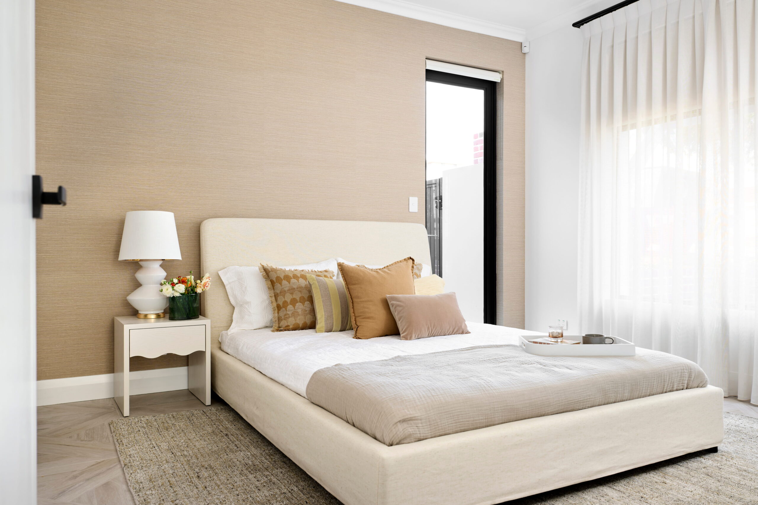
Once the mood is clear, the palette gets built from fixed finishes outward. Flooring, benchtops, stone, cabinetry: these are the materials you’ll live with for decades, the ones that cost the most to change if you get them wrong. Paint, by comparison, is one of the simplest things to adjust.
Some clients arrive loaded with Pinterest boards and magazine clippings, which Nicola welcomes. “I can go through those images and pull the common threads out of them. Sometimes they might be drawn to something but not necessarily know why. I kind of have a bit of a superpower where I can go, okay, I can see you love the timber tone of this, or the metallic of that.” It’s the kind of clarity that comes from doing this hundreds of times, and it saves clients from chasing individual pieces that looked beautiful in a photo but don’t actually belong in the same room.
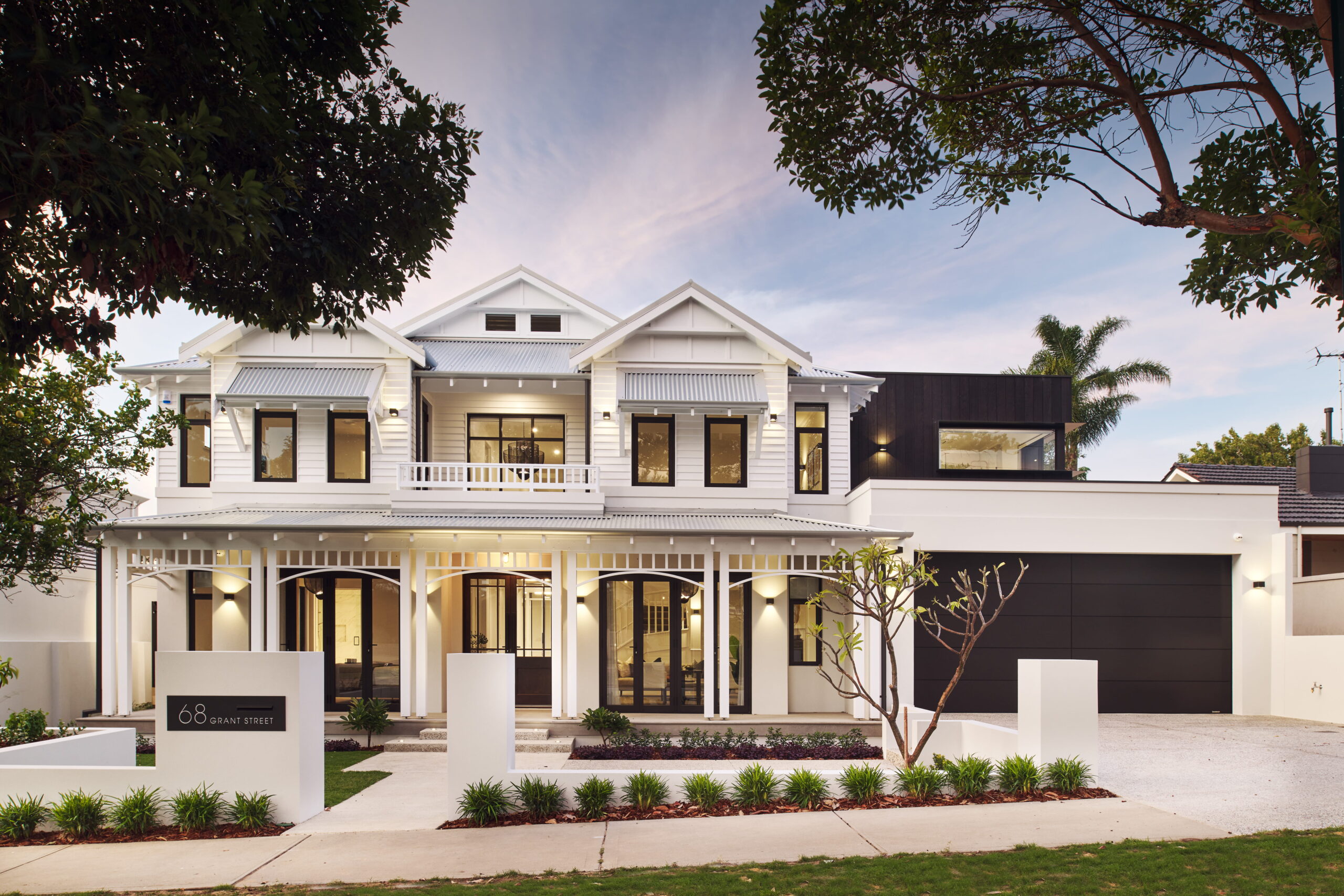
Flow from the outside in
Think about the last home you walked into that felt effortless. Not a single room that impressed you, but a whole house that seemed to hold together from the moment you stepped through the front door. What did that feeling come from? Almost certainly, the colour palette.
Nicola’s starting point is always the exterior. This outside-in approach is central to how Stannard Homes guides clients, ensuring the transition from façade to interior feels intentional from the moment you arrive. “We normally start with the outside of the home. We’ll do a flat lay for the outside and make sure that’s all working well together. And then from that point, we go to the inside. It’s usually always the cabinetry, benchtops, floor tiles or timber floors.”
That sequence matters. The façade materials set a tonal direction that the interior needs to follow. If the brick and render run warm, a sudden shift to cool grey cabinetry will feel disconnected the moment someone crosses the threshold.
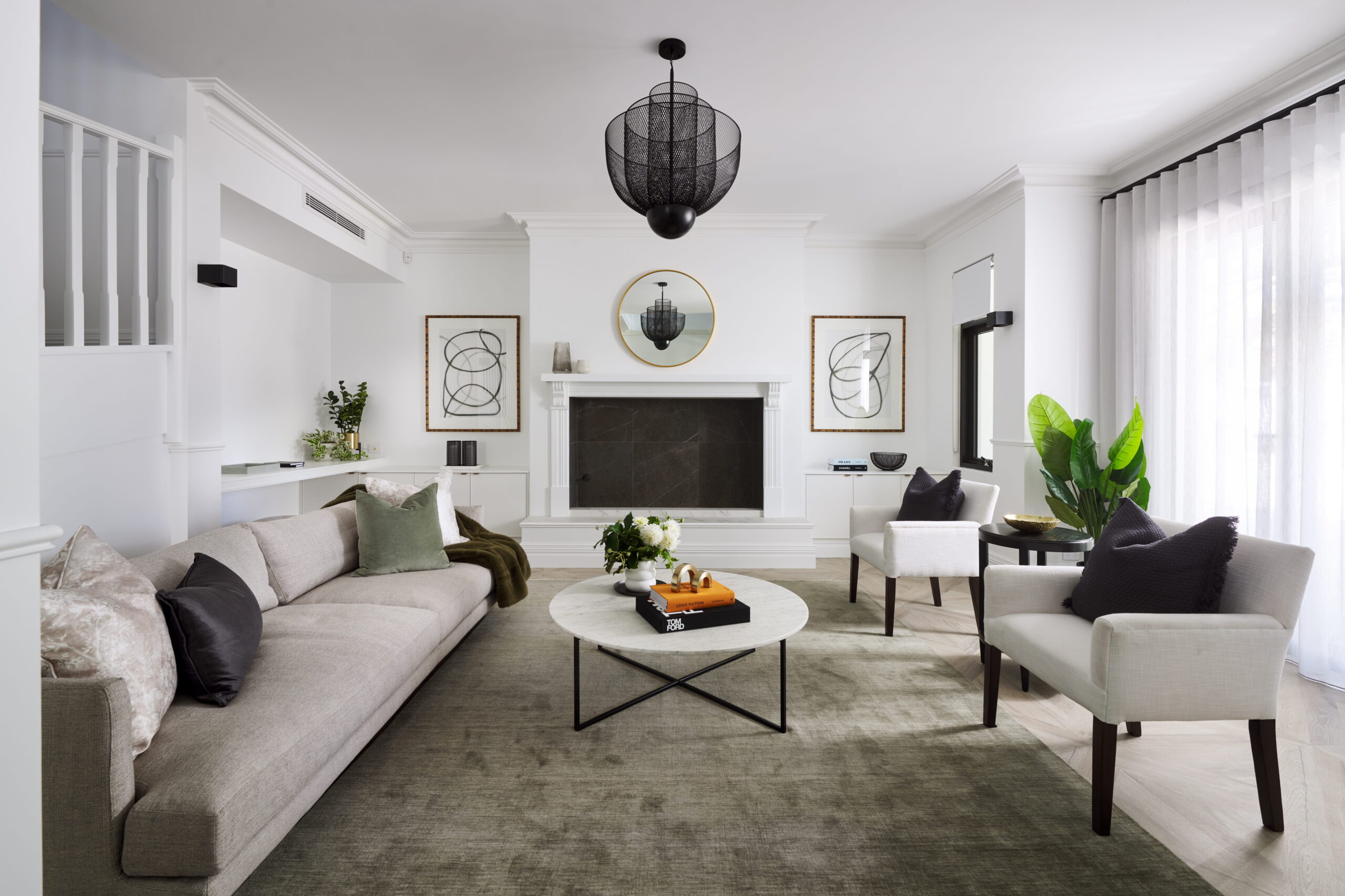
Inside, Nicola creates variety through controlled moments of brightness rather than broad colour shifts. “With bright colours, I would do that in small ways. A laundry splashback, maybe a kitchen splashback, we might go a little bit brighter. Whereas the rest of the home, I’d prefer to keep more tonal.” One consistent neutral through the main living areas, with colour introduced through décor, prevents the jarring effect of contrasting wall tones meeting on a raw edge.
The result is cohesion with character. “Cohesion is the key with any home,” Nicola says. “What we want to do is create flow from start to finish. From the outside in, everything needs to make sense and be part of that same family.”
How Perth’s light changes everything
Have you noticed how the paint colour in your bedroom looks completely different at 7 am compared to 4 pm? That shift happens everywhere, but in Perth it’s amplified. What makes choosing a luxury colour combination for home interiors here different from Melbourne or Sydney is the sheer intensity of the light. With over 3,200 hours of bright sunshine a year, roughly 35% more than Melbourne, Perth’s sun doesn’t just illuminate colour. It transforms it.
Australian paint manufacturer Haymes Paint puts it plainly: “Australian light is typically bright and direct. This means undertones show up quickly, and colours can feel stronger once they are on the wall.” Nicola sees this play out across every project: “Light is going to play a huge role in Perth. We’ve got a very bright, vibrant light, and depending on the orientation of each room, the windows, the amount of windows, it varies dramatically.”
Orientation is the hidden variable. A detailed guide from Australian paint manufacturer Resene explains how north-facing rooms in the Southern Hemisphere receive the strongest, most direct light, pushing warm tones even warmer, while south-facing rooms bathe in cooler, indirect light that can make neutrals look muddy. The same white that glows in your living room can fall flat in a south-facing hallway ten metres away.
Nicola is firm on exteriors: “I really prefer to avoid the really bright whites because they can actually be quite blinding. Whilst we do definitely use whites on the outside of our homes, they’ve usually got a bit more depth to them.”
The practical lesson? Never commit to a colour from a screen or a small chip. Once you’ve chosen your preferred hues, testing physical sample pots in the actual room at different times of day is the most reliable way to understand how a colour will truly perform. In Perth’s light, what you see at breakfast and what you see at sunset can feel like two completely different colours.
Cohesion without repetition
So how do you make twenty rooms feel connected without making them all look the same? It’s one of the most common questions clients wrestle with, and the answer comes down to undertone rather than matching paint colours. It’s also something clients are guided through during the selections process, where undertones are considered across all materials at once rather than in isolation.
Warm materials sit naturally together: timber, bronze hardware, travertine stone, cream-toned cabinetry. Cool materials do the same: grey stone, brushed nickel, white marble, blue-toned paint. When everything in a room shares the same undertone family, the eye reads it as harmonious, even if the individual finishes are quite different from each other.
This is the quiet mechanics behind any successful luxury colour combination for a home, and Nicola keeps things interesting within it through texture and tonal variation rather than colour contrast. “Repetition can be avoided with tone, variation, and lots of different textures. That’s what keeps the home interesting and avoids it from feeling flat.”
Where warm and cool do need to coexist, she handles it with precision: “If you went for, say, a grey kitchen, you could still do a bronze handle, so you’d bring a warm metal in. That can still work. But it’s got to be done quite carefully and skillfully because it doesn’t always work.”
For those who like a framework, the 60-30-10 rule outlined by Homes & Gardens offers a useful starting point: 60% dominant colour across walls and large surfaces, 30% secondary in furniture and cabinetry, 10% accent in hardware, art, and textiles. It’s a guide, not a formula, but it prevents the trap of either too much uniformity or too much visual noise.
Where trends belong
Can you picture the exact shade of grey that dominated kitchen cabinetry five years ago? It’s already dating. That’s the speed at which colour trends cycle, and in a home you’re investing seven figures into, locking a trend into a fixed surface is an expensive gamble.
Nicola is diplomatic about the influence of renovation media: “Those home renovation shows, they’re really inspiring, and they’re fun to watch, but they’re not real life.”
Her approach is to redirect rather than refuse. “If you want to go for a trend, be mindful. That’s exactly what it is, a trend. So in five years’ time, it’s not going to be around. How about we do that in a different way?” That different way is almost always soft furnishings: “We can bring those additional colours in with rugs, with art, and in that kind of capacity where those things are easily changed afterwards.”
Nicola’s anchor question cuts through the noise every time: “The key is to stick with timeless and neutral finishes because they are the building blocks of their home. Most of these homes are forever homes. So a question I often ask clients is, how will you feel about that finish in five years time?” When they sit with that honesty, most clients arrive at the more considered option on their own. The most enduring luxury colour combination for home design is almost always one built on those natural, neutral foundations rather than whatever’s trending this season.
The mistakes that cost the most to fix
If there’s a single pattern behind the colour regrets people carry through a new build, it’s this: decisions made in isolation rather than in context. This is exactly what the Stannard selections process is designed to avoid, with materials, colours, and finishes reviewed together rather than as separate decisions.
Choosing paint before materials are finalised is the most common. A wall colour picked on its own may clash once the flooring, stone, and cabinetry arrive, because those fixed elements carry undertones that paint needs to respond to. Even a seemingly neutral white can pull pink, green, or yellow depending on its base, as Resene’s colour guide points out, and those shifts become glaring when placed against the wrong stone or timber.
Trusting screens over physical samples is the second. Digital colour is an approximation at best, and Dulux explicitly cautions that on-screen colours should be treated as a guide only. Testing with large painted samples in the room where the colour will live, under the lighting conditions it will actually experience, is the only reliable method.
Underestimating how light changes colour from room to room is the third. A warm grey that feels sophisticated in a south-facing study can look flat and dull in a sun-drenched living zone facing north. And the fourth is committing to a trend with a permanent finish. A splashback can be replaced in a weekend. A full kitchen of cabinetry in this year’s trending shade cannot.
How Stannard Homes takes the overwhelm out of colour
Coordinating a luxury colour combination across an entire custom home is where most clients feel the most exposed. Every Stannard Homes client works with interior designer Nicola Draper-Henkel as a part of the build.
During a dedicated selections day at Design Home on Churchill in Subiaco, Nicola guides clients through some of the key material and colour decisions using the flat lay process, where physical samples are laid side by side and assessed together under natural light.
“I always want them to have an enjoyable experience,” Nicola explains. “We start with one particular material, and we start building from there, and then we stand back, reassess, and just keep interchanging those elements.” She narrows hundreds of options down to two or three that all work, so clients feel empowered. Those selections flow to Lee, the client selections and finishes consultant, and then to the build team, with every department working under one roof so nothing gets lost in translation.
Clients consistently describe the result the same way. “Usually a bit of relief,” Nicola says. “The lack of overwhelm. Always like, oh, that was fun. I don’t know why I was worried.”
If you’re planning a build and want to understand what to expect from the design process, the team would love to hear from you.
The palette sets the tone for everything that follows
Colour isn’t decoration. It’s the thread that connects every material, every transition, every shift in light from one room to the next. Get the luxury colour combination for your home right, and you won’t think about it consciously. You’ll just walk through the space and feel that everything belongs together.
If you’re ready to start the conversation about your dream home, get in touch with the Stannard Homes team.
Frequently asked questions
1. What is the best luxury colour combination for home interiors?
Start with how you want the home to feel, then anchor the palette in your fixed finishes: flooring, stone, and cabinetry. Choose paint last, once all hard materials are locked in. Keep undertones consistent and test everything with physical samples in the actual room at different times of day.
2. Should I choose paint colour before or after selecting materials?
After. Fixed finishes like stone, timber, and cabinetry carry undertones that paint needs to complement. Choosing paint first often leads to mismatches that only become apparent once materials are installed, and those are expensive to correct.
3. What colours work best in Perth’s bright light?
Warm neutrals and whites with depth tend to perform better than cool greys or stark whites, which can wash out or look blinding in Perth’s intense sun. Always test colours in the actual room at multiple times of day, as Perth’s light shifts dramatically between morning and afternoon.
4. How do I choose a luxury colour combination for home design that flows?
Keep undertones consistent across your main living areas and use one neutral base throughout. The strongest luxury colour combination for home builds starts with fixed finishes and works outward, introducing variation through texture and tone rather than contrasting paint colours. Reserve bolder moments for contained spaces like a laundry splashback or powder room.
5. How do I add personality to a neutral colour scheme?
Through soft furnishings, rugs, art, and decorative objects that can be changed over time. Keep fixed finishes timeless and neutral, then layer personality on top. This gives you the freedom to refresh a room’s look without renovating.

